

Viral

Share
Published 12:49 8 Nov 2023 GMT
 Add us as a preferred source on Google »
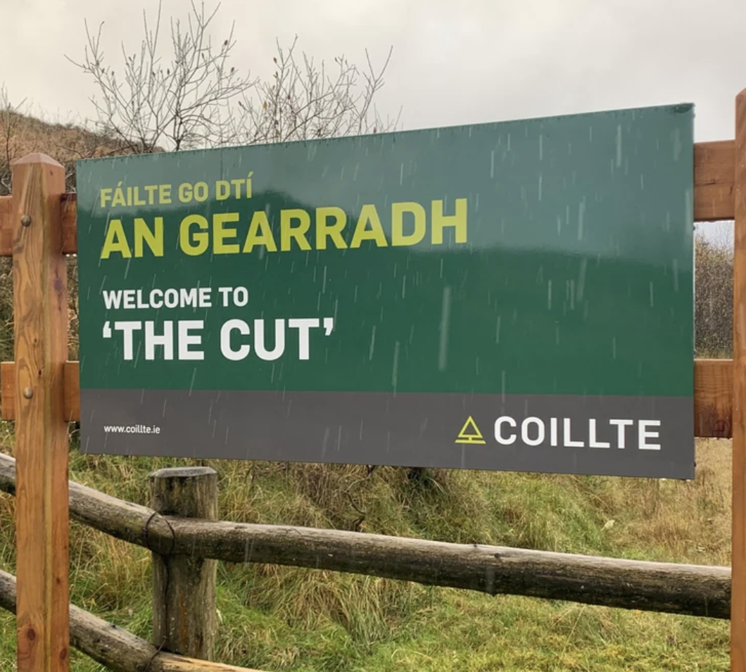
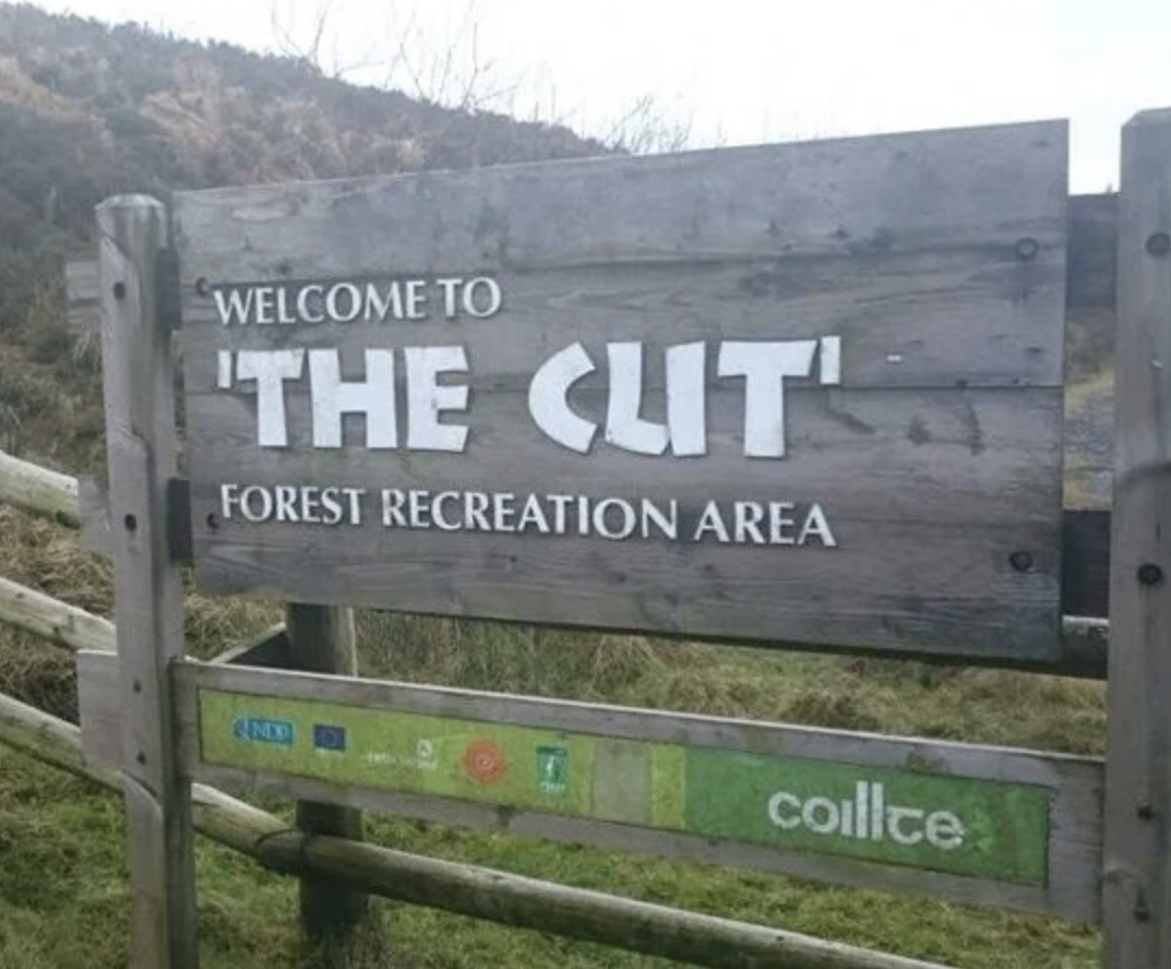 After years and years of the sign post promising The Cl*t, a new sign was installed in its place that makes it a little more clear, to the dismay of the internet.
The change has incited anger and disappointment amongst Reddit users, who didn't delay in giving their thoughts on the new sign.
After years and years of the sign post promising The Cl*t, a new sign was installed in its place that makes it a little more clear, to the dismay of the internet.
The change has incited anger and disappointment amongst Reddit users, who didn't delay in giving their thoughts on the new sign.
 One user said: "New one is just vapid, boring, printed shite. Also the style of it already is starting to look dated (very 2010s IMO). Old one was class with cutout letters and a timeless appeal."
Another said: "Yeah the redesign is extremely dull. Just a very standard minimalist layout with sans serif. Like all dull corporate design from the 2000s and 2010s. I miss the fun and vibrancy of designs from the 80s and 90s."
The only positive change was that the new sign now includes the Irish translation: An Gearradh.
Header images via Micro Snipes on Reddit
READ ON:
- Santa will arrive to Kilkenny by boat this month, to mark the launch of the city's Christmas market
- Ireland's first ever satellite is student-built and about to launch into space
- WeWork file for bankruptcy months before opening of new Dublin office
One user said: "New one is just vapid, boring, printed shite. Also the style of it already is starting to look dated (very 2010s IMO). Old one was class with cutout letters and a timeless appeal."
Another said: "Yeah the redesign is extremely dull. Just a very standard minimalist layout with sans serif. Like all dull corporate design from the 2000s and 2010s. I miss the fun and vibrancy of designs from the 80s and 90s."
The only positive change was that the new sign now includes the Irish translation: An Gearradh.
Header images via Micro Snipes on Reddit
READ ON:
- Santa will arrive to Kilkenny by boat this month, to mark the launch of the city's Christmas market
- Ireland's first ever satellite is student-built and about to launch into space
- WeWork file for bankruptcy months before opening of new Dublin office
Viral

Viral

Viral

Viral

Viral

Viral


